Vinyl banner design is about as easy as it gets for the non-professional graphic designer. Generally speaking, a vinyl banner is easy to design. Anybody with a little bit of graphic design experience can design a banner. Using a bit of imagination can make a world of difference.
And even if you have no experience, your supplier (for instance, www.signartetc-banners.com) can point you in the right direction, or even design your banner for a small charge.
Here are some things to watch for when designing a vinyl banner...
Vinyl Banner Design Tips # 1. Use software that handles CMYK full color output.
There are at least three kinds of software you can use:
-- Image editors like Photoshop.
-- Page Layout programs like Quarkxpress, Pagemaker, or InDesign.
-- Illustration programs like Illustrator.
Generally speaking, programs that are designed for consumers or general office applications are not recommended: e.g., Word, Wordperfect, Publisher, Excel, etc. If you have a specific inquiry, don't hesitate to ask your vinyl banners supplier. A good source of information is your contact person at SignArtEtc-Banners.com. You can ask a design or production related question by using the contact form on any page on the site.
Vinyl Banner Design Tips # 2. Keep your design simple and striking.
The best designs for vinyl banners contain two or three basic elements. Usually these will be a photograph, a large headline, and an "identifier" such as your company name, logo, or phone number.
Vinyl Banner Design Tips # 3. Use bright colors.
The most striking vinyl banners have lots of bright colors.
Vinyl Banner Design Tips # 4. Design your vinyl banner so it is readable for your target audience.
If it is going on a building or beside a road on a fence, or on an outfield fence at a baseball, soccer or football field, MAKE SURE YOUR MOST IMPORTANT MESSAGE IS LARGE ENOUGH TO BE READ.
Vinyl Banner Design Tips # 5. Make sure your images have sufficient resolution.
For some advice on image resolution, see the Vinyl Banners FAQ.
Vinyl Banner Design Tips # 6. Make sure your vinyl banner fits the area where you're going to mount it.
Don't guess at the size. Most people who are not familiar with signage will UNDERESTIMATE the required size.
Tuesday, July 7, 2009
Vinyl Banner Design Basics
Posted by Juris Blogger at 6:40 AM 6 comments
Labels: banner design tips, graphics, signs
Monday, July 6, 2009
Get The Most From Your Vinyl Banner
4 Design Tips For Effective Banner Marketing
By its very nature, a vinyl banner is meant to be like a big flexible poster or billboard. That makes it a piece of advertising, so all the rules and techniques that apply to advertising design should apply to vinyl banners as well.
Rookie Banner Design Mistakes
In the advertising business you see rookie advertisers making the same design "mistakes" over and over again. They think people are going to walk up to their poster, billboard or vinyl banner and examine every detail. So they cram it with lots of product information, a detailed map of how to get to their store, and the phone numbers of all their sales reps.
It comes as a bit of a shock to learn this is not how things work. In fact what happens is this: since we are bombarded with advertising images all day, every day, we do our best to ignore them. Especially the ones with lots of boring details.
It gradually dawns on the budding advertiser that what people DO notice is something striking, different, loud, funny, or shocking. That is why most professional advertising tries to create a distinctively memorable selling feature, and then focus on it with striking images, snappy, memorable slogans, or catchy, sing-able (often loud!) music.
Banner Design Tips # 1. Keep it simple
The first, most important rule of thumb when creating a vinyl banner design is to KEEP IT SIMPLE. Stick to two or three main elements that communicate your most important selling points. Identify your product with a striking photo (if you have one), and then define the most important selling features with the other elements: usually a striking headline, and some other "feature" like the price, the amount of discount, or the "free" thing you are giving away.
Banner Design Tips # 2. Use Striking, Colorful Elements -- the "Photo ID Model"
Of course these days we are talking about vinyl banners made with FULL COLOR digital printing. So when creating your vinyl banner design, it is usually safe to use what I call the "Photo ID Model" for digitally printed state-of-the-art vinyl banners. The "Photo ID model" uses four basic elements:
- Product photo or photo collage
- Main Headline
- Product Description
- Company Identifier
The Photo ID Model is not the only design style you can use for your vinyl banner, but it gives you a professional looking, highly effective place to start. For a more complete description of this design approach, see my article titled "The Photo ID Advertising Design Model"
Banner Design Tips # 3. Use Color Effectively
Use COLORS to your advantage. Use FULL COLOR PHOTOGRAPHS that contain interesting bright colors. And make your headlines, special offers, and company identifiers jump out by using red, white or yellow on a black background.
This is called the "reverse text" or "knock out" technique. Look at the hundreds of signs you see everyday, and notice how often reverse text is used. The contrast between the light colored text and black (or dark) background gives your text much more graphic impact.
Banner Design Tips # 4. Use Your Imagination. Be Creative!!!
Unfortunately the "Photo ID Model" is so effective -- so obvious -- it is very tempting to use it without thinking much about the IMPACT or CREATIVITY of the various elements. So for instance, a typical vinyl banner or other type of display ad for a fictitious company called "Perk-it-Up Coffee" will often start out like this:
"Perk-it-Up Coffee" (headline)
Photo of can of coffee (photograph)
"Made from the finest coffee beans, blah, blah, blah."
Order yours today from Perky People Coffee, 123 Java Hwy
Notice how this list is just a series of relatively unimaginative "facts" about the product: the product name, what it looks like, how it is made, where you get it. Not terribly inspiring. No clear statement of its most important features. No attempt to "sell" the product.
You can do much better than that! With a little bit of imagination your "Perk-It-Up" vinyl banner could have MUCH MORE IMPACT. For instance, even a fairly uninspired headline like the one above will come to life if you associate it with an interesting photograph.
And I'm not just talking about a picture of the product. Use good looking people if you can. For example, a photo of happy, wide-eyed person holding a "Perk-It-Up" mug looking as though she just had a major java hit. Now even a boring headline like "Perk-It-Up Coffee" means something. And now you can go the next step and be more creative with your headline too!
Keep it simple, make it striking, use color effectively, and be creative. Then your vinyl banners will have the impact you are looking for.
Check out www.signartetc-banners.com if you need help with banner design or just need your banners printed quickly and professionally…….all at a great value.
Posted by Juris Blogger at 8:12 AM 2 comments
Labels: banner design tips, banners, graphics, signs
Thursday, July 2, 2009
Sign Design Tips
Seven Secrets Of Highly Effective Sign Design
There is a "secret recipe" for highly effective sign design. Just one missing ingredient will have a negative effect that can destroy the appearance of an otherwise well designed custom sign.
The good news is, designing visually appealing signs isn't rocket science. Following solid principles graphic designers use to create attractive, high impact custom signage will help you yield the greatest return on your advertising dollars.
- Are ALL CAPITAL LETTERS Easier To Read?
- What Are The Very Best Letter styles To Use In Signage?
- What is "White Space" And How Can You Use It To Enhance Your Design?
- When Is Less, More?
- How Big Is Big Enough For The Message To Be Readable On A Sign?
- What Are The Best Color Combinations To Use?
- Should You Use A Border On Your Sign?
Use this information anytime to create a competitive advantage in your sign program. Let's get started.
Secret # 1
Are ALL CAPITAL LETTERS Easier To Read?
There is a misconception that exists that since ALL CAPITAL LETTERS are "bigger" than their lower case counterparts, that they must be easier to read from a distance. However, visual tests have scientifically verified that Upper And Lower Case Text is more legible from a distance than ALL UPPER CASE LETTERS. Since passing motorists may only have 2-3 seconds to read your message, maximize the readability of your custom designed sign by limiting the use of all capital letters.
ALL CAPS do have a place in effective sign design. However, since you know now this secret, you will automatically be mindful if and/or when you choose to use them. When you preview a design for your new sign, stand back from the monitor to get a better idea of what the text will look like from a distance.
Top Secret # 2
What Are The Very Best Letter styles To Use In Signage?
In an attempt to stand out in the crowd, inappropriate type styles are often chosen for signage. "Designer Fonts" may look good on business cards and stationary, but they can greatly diminish the effectiveness of a sign. To make matters worse, fancy type styles are often used completely wrong.
For example, a
 on a sign can be difficult enough to read but nobody should ever use ("ALL UPPER CASE SCRIPT") or
In general, clean, crisp, easy-to-read type styles should be used for maximum legibility. Prime distinctive examples include
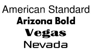 Variations of the same type style can also be used throughout the design
 If you look at what national companies do with their signage, you will notice clear, easy to read text in almost every case.
The second most legible group of type styles includes the serif style of fonts. Serifs are short horizontal lines added to the tops and bottoms of traditional typefaces, such as "Times Square" seen below. Please note the differences below between the block style letter (sans-serif or "without serifs") and the serif style letter.
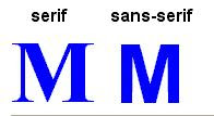
There are several variations of similar looking serif type styles including
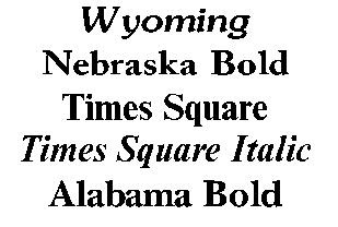 Each letter style has its own unique, defining characteristics. The distinctions from one serif letter style to the next are often subtle.
* As a general rule of thumb, never use more than two different letter styles in a single sign design. Our Online Sign Design Center let's you instantly select, view and revise type styles at will. By playing with different styles and combinations, a distinctive identity will emerge that will project your business image professionally. Top
Secret # 3
What is "White Space" And How Can You Use It To Enhance Your Design?
White space also known as negative space simply refers to the empty area of a design that is devoid of any text or graphics. The empty spaces surrounding text and graphics are just as important as other design considerations. There is a tendency to "fill up" the available area with as much as possible. To leave area unused almost seems counterintuitive because we all want to get the most bang for our buck.
So why is white space so important to create highly effective sign design? Part of the reason is psychological and part of it is physical. Text without adequate white space leaves us feeling crowded and cramped. Text needs room to breathe. When text is crowded, the message becomes too difficult to read.
A general rule of thumb is that around 30% to 40% of the sign's face area should be left as white space for optimal readability. Trust your own judgment. If a design looks too crowded, it probably is.
Secret # 4
When Is Less, More?
This design tip goes hand-in-hand with the effective use of white space.
The most successful sign will communicate effectively and concisely. Therefore, in as few words as possible, clearly communicate the message you wish to convey to your target audience. Crowding the sign with too many words or lines of text makes it increasingly difficult to read from a distance. The number of words used on a sign is a classic example of where, "Less Really Is More".
Once you preview a completed design, stand back and look at it again and try to put yourself in your customers' shoes. What will most appeal to them? Top
Secret # 5
"How Big Is Big Enough For The Message To Be Readable On A Sign?"
Any sign that can't be easily read from the distance intended is virtually worthless. So when in doubt, better to go larger than too small.
The scientific answer though lies in the Letter Visibility Chart originating from a joint research project by the Pennsylvania Transportation Institute, Penn State University and the United States Sign Council.
Unlike a lot of charts that seem confusing at first, this chart is very easy to read and understand at a glance. The beauty of this chart is in it's simplicity of use.
For example, if the farthest point you want your message to be seen from is 100', the Chart indicates that you should use a minimum 3" letter height. However, for "Best Impact", a minimum 10" tall letter is called for. The greater the size, the greater the impact and legibility of the message.
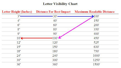 Selecting the right size lettering for your next project is no longer guesswork. Use the following steps to 'reverse engineer" the exact size your sign should be. Working "backwards", you can easily determine the optimal letter height for your signage. This will require a little bit of your time and effort but isn't your business worth it?
- Start with the most distant point you want your audience to be able to read the sign
- It's best not to guess so buy a cheap tape measure so you can accurately measure the distance
- Once you know the viewable distance, decide exactly what you want the sign to say
- As a rule of thumb, a 6" tall letter will take up around 6" in width. So if your line of text has 10 character spaces, you will need a sign at least 60" plus in width. Remember to include enough white space around text and graphics when deciding upon the final size of the sign itself.
- If your sign has more than one line of text, add all of the vertical heights of the lines of text and add about a third more to that number for the height of the sign. For example, if all the lines of text add up to 12" tall, add about a third or 4" to make the overall height of the sign about 16". Adjust as needed to make the layout look balanced.
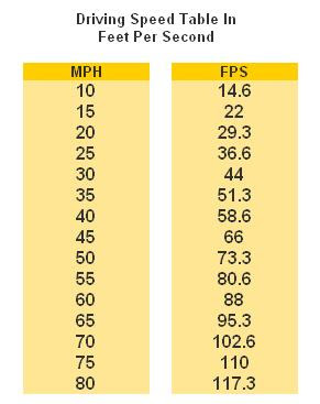 Speed is another factor that should be considered for signage visible from the street. The following chart outlines the feet traveled per second at different speeds. This is a supplemental tool you can use to help choose the optimal size for your custom signage.
Use the data in this table combined with the Letter Visibility Chart above to determine the amount of time potential customers will have to read a sign while driving.
For example, an 8" letter is has a maximum readable distance of 350'. If a vehicle is traveling at 45 mph, then divide 350 feet by 66' feet per second (FPS) to determine that a driver will have a maximum of 5.3 seconds to read the sign until they pass it.
You now possess the secrets to optimizing letter sizes that will be easily read by your target audience. Top
Secret # 6
"What Are The Best Color Combinations To Use?"
The effective use of color is vital to the effectiveness of a sign. So how exactly, do you use color "effectively", right?
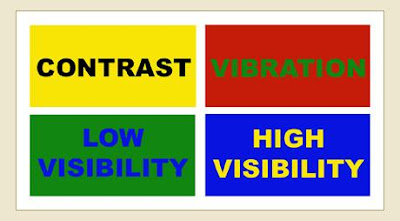
The key is contrast. So what exactly is contrast? Contrast is the difference in brightness between the light and dark areas present in a single design. A bright yellow background for example, will contrast well with dark letters such as black, a dark shade of blue and even purple. The greater the contrast or difference between the light and the dark colors, the more legible text is from a distance. Colors that are closer together like a medium gray letter against a black background won't contrast as well and therefore will be more difficult to read.
 Contrast:
Take a look to your left. Which of the two looks larger... the white one? They are both the same size. The use of a light colored letter against a dark background lends to it seeming larger. Light letters tend to come at you, where dark tend to recede.
Generally speaking, white as a background color is by far the most versatile because more colors naturally contrast better against a neutral white background than any other single color. When you choose a different background color for a custom sign other than white, you limit your choices for colors that will both stand out and "go with" that background color. That's not a good thing or a bad thing - it's just something to keep in mind when making color selections.
Comparing Visibility Of Different Color Combinations
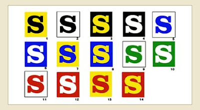
These 14 color combinations for lettering were tested for readability at a distance. The test were carried out on different groups under the sponsorship of the Outdoor Advertising Association of America (OAAA). The results ranked in the sequence shown, with #1 the most legible and #14 as the least legible. Negative letters in 3, 4, 6, 8, 10, 12 and 14 appear to be larger in appearance than their positive counterparts.
 Color Combination Effects
 Contrast Solutions
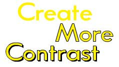
Weak color contrasts can be strengthened with an outline and/or drop shadow.
Colors create a mood, a perception, a feeling and speak very loud to our subconscious generating either a positive or a negative reaction within seconds. Consider the psychological characteristics of color when making your selections.
BLACK suggests authority, power, boldness, seriousness, professionalism, is distinguishing and classic. Business wise, it's great for creating drama and is good for a background color. It is ideal for text on a light background.
BLUE suggests security, authority, faithfulness and dignity. For business it suggests sanctuary and fiscal responsibility. It is the most popular and the second most powerful color. Blue can also be cold. People are more productive in blue rooms.
BROWN suggests richness, politeness, helpfulness and effectiveness. In business it suggests less important items. Solid, reliable brown is the color of earth and is abundant in nature. Light brown implies genuineness while dark brown is similar to wood or leather.
GRAY suggests authority, practicality, earnestness and creativity. Business wise it is traditional and conservative.
GREEN suggests health, fertility, freedom, freshness, healing, tranquility and jealousy. Businesses use it to communicate status and wealth. It is the easiest color on
the eye and can improve vision. It is a calming, refreshing color.
ORANGE suggests pleasure, cool, excitement, cheer, endurance, strength and ambition. For business it is good for highlighting information on charts and graphs.
PINK suggests femininity, gentleness, well being and innocence. For business you must be aware of it's feminine links and implications.
PURPLE suggests spirituality, royalty, luxury, wealth, sophistication, authority and mournfulness. In business it is upscale and works with artistic types. It is also
feminine and romantic. However, because it is rare in nature, purple can appear artificial.
RED suggests excitement, strength, sex, passion, vitality, aggressiveness and commands attention. Business wise it's associated with debt, is great for boldness and accents. The most emotionally intense color, red stimulates a faster heartbeat and breathing.
WHITE suggests refinement, purity, devotion, contemporary and truthfulness. For business it can be sterile and refreshing.
YELLOW suggests warmth, sunshine, cheer, happiness, jealousy, deceit and cowardice. Business-wise it appeals to the intellectual types and is a good accent. Yellow enhances concentration, hence its use for legal pads. It also speeds metabolism. It is the most difficult color for the eye to take in, so it can be overpowering if overused.
People respond more to non-verbal cues than verbal ones. Make sure you use the psychology of colors in all your marketing, especially when you can't be face to face.
Secret # 7
Should You Use A Border On Your Sign?
 Adding a border increases reading speed by 26%. Borders are often recommended whenever automobile traffic is the intended audience.
With forethought and careful deliberation, present the image you want to project that will attract customers and entice them to stop, shop, and buy. For example, full-color photo-realistic digital pictures can be incorporated into designs to add greater impact. Logos, artwork and other graphical elements can also be added to visually stimulate the viewer towards the desired action.
Actively participating in the final design of your sign is an ideal opportunity to make the best first impression possible. Put your best foot forward. Nobody else knows your business and objectives better than you do. Nobody cares nearly as much about your success as you do. You are the architect of you business. Plan well.
If you choose to use www.signartetc-banners.com - our own graphic designers will provide a professional review of your sign design and offer suggestions.
Monday, June 29, 2009
10 Tips For Advertising With Vinyl Banners
Vinyl Banners are a simple cost effective way to promote your business. Read more to find out how to make the most of banner advertising.
1. What will your banner be used for?
Banner advertising is very versatile and can be used inside, such as in shops, offices or museums; outside shops, restaurants and on buildings; for exhibitions and trade shows and at sporting events and concerts. Outside banners need to be more durable and weather resistant than indoor ones.
2. What is the aim of your banner?
Your banner can be used to advertise many different aspects of your business. What about promoting a sale, the opening of your new business, increased opening hours at yourshop or café, a new product range or new season stock in your shop; a live band playing at your pub; the fact that you now serve food in your museum, or are launching a new product at a trade show?
3. What needs to be on your banner?
Depending on the aim of your banner, you may need to include the message, phone number, website address, corporate slogan and logo. Or you may only need basic information such as Sale Now On, Car Park Next Left, Under New Management, or Now Open Longer.
The banner will need to contain just enough information to convey your intended message. Too much information and people will be put off, and if there's not enough information people will ignore it or not know what to do.
4. How big does your banner need to be?
If your banner is too small it won't be easy to read. If it's too big it might be overpowering. Consider the amount of space that the banner will take up, and measure carefully.
5. What shape does your banner need to be?
The shape will depend on where the banner is going. Long and thin banners work well for down buildings such as a pub or restaurant, whilst short and wide are ideal for above a shop, and perhaps you want square banner for a concert or sporting event.
6. Who will design your banner?
If you are a creative type of person, you could design a custom vinyl banner yourself, and it will be cheaper than employing a designer to do it for you. Using an experienced designer will ensure that your banner will be appropriate for printing, and will be more professional than using clip art and a compromised font, from a word processing package.
7. Are the images clear and obvious?
Images and artwork that look clear on a piece of paper may not be as obvious once the artwork has been turned into a banner. Are there too many colours or not enough?
8. Is your banner easy to read?
Will somebody driving past be able to tell what you are promoting and know what to do? Can someone remember the website address or phone number? Will somebody walking past be able to as well? That font might look good to you, but is it easy for your intended customers to read.
9. Are there too many colors on your banner?
Whilst you may be tempted to make use of all the colors available to get even better value for money, your banner will be easier to read if you keep the colors simple.
10. How will your banner be attached?
Often overlooked, how the banner will be attached is arguably just as important as the design of the banner. The popular choice is to use metal eyes so that rope or elastic cord can be used to easily hang the banner. Internal banners will not be subjected to wind and movement the same way that external banners will be. If you are able to use existing railings, or shop fixtures to hang your banner on, you can then decide which method of attaching will be best. Perhaps you will need to use additional fixing methods, or make alterations to the building structure.
Want to advertise your business to passing traffic? Need to let people know your restaurant is open longer? Want to tell people you've got a sale on? Then use banner advertising and let your customers know. Get a vinyl banner printed today.
Friday, June 26, 2009
Church Banners
Bulletin boards are a good venue to post church news, announcements, reports and updates. But not all people read bulletin boards. They may be cluttered and contain a lot of old news mixed in with the news. Sometimes, important notices are overlooked or don’t get the attention they need.
When you have to announce something very important, do it with a banner posted on the church’s façade to everyone to see. As church announcements are relatively simple, a banner wouldn’t cost much. Parishioners will learn more about your activities and are more likely to participate.
For special occasions, like a Christmas play, anniversary or a visit from a senior church official; spread the feeling of welcome and joy by hanging a colorful, announcement banner. You can have one done on vinyl in full colors, attractive images and catchy text. A Banner will add a touch of professionalism to any church announcement you may have.
Church banners can carry photo quality images and backgrounds that attract and bring attention to your church project. You can have it designed in such a way that drivers and pedestrians will see it across the street. They are the perfect welcoming sight for your important guests, as they do convey hospitality and warmth. A vinyl banner is waterproof, fade resistant and will last a long time. You can use it for church signage as well. You can print church schedules and list weekly or monthly activities. Better informed parishioners can and will contribute to your cause.
Posted by Juris Blogger at 6:53 AM 0 comments
Labels: banners, church banners, graphics, signs
Tuesday, June 23, 2009
Full Color Vinyl Banners

Most of us know what a "banner" is -- not the kind used in web pages -- but the kind used as signs on the sides of buildings, on fences, or across the stage at conferences. Roughly speaking, a banner is a large flexible sign or poster made of a durable material that can be easily folded or rolled. We are used to seeing banners strung across the road at fall fair time, or to promote a worthy cause.
In recent years banners or "banner signs" have become much more versatile than even five or six years ago. Banner signs are now used in all kinds of places where we used to see more permanent signs. Instead of a sign made of wood or aluminum, we now often see a vinyl banner sign that serves the purpose very adequately.
These days, the most common material used to make outdoor banners is smooth, good looking but durable vinyl. A banner printed on vinyl will stand up to the sun and rain for a number of years, so vinyl banners are often used in places where a quick, low cost alternative is needed.
Sometimes vinyl banners serve as a temporary substitute for a more permanent sign which will come later. Other times where the site is only temporary -- such as a construction site, or a special event like a family reunion -- a full color custom vinyl banner is the only sign that will ever be used.
The great advantage of banners is that they are made of flexible and lightweight material. That means a vinyl banner can be rolled up or folded when it is time to take it down or move it to a new location. They are also relatively inexpensive when compared to the alternatives. What has made vinyl banners so versatile is that they can now be printed digitally in beautiful full color. Printing vinyl banners used to be a fairly crude and laborious process, but the "digital revolution" changed all that. Special printing machines can now print directly onto vinyl that can be used either indoors or outdoors.
The design and printing process is actually quite simple -- as long as you know something about digital printing. Banner designs can include photographs, artwork, fancy backgrounds, company logos. In other words, any graphic image that can be captured in a computer file can be printed on a vinyl banner.
All suppliers do not use the same process
The best place to find a source for vinyl banners is on the internet. A small number of companies specialize in providing low cost, fast-turn-around vinyl banners. A specialty vinyl banner company has mastered the details of banner printing and prints hundreds or even thousands of them every month. They can usually offer the lowest price and fastest delivery too.
But not all vinyl banner suppliers use the same process or the same equipment. Some use silk screening, while others use low end ink jet printers. The best suppliers use higher end UV ink printers. It is important to know the difference between these processes, and often you cannot tell by looking at the descriptions provided to you on supplier websites.
Silk screening has adapted some digital capabilities, but when it comes to the actual printing, it is still an older "low tech" process. It remains an important method of printing certain things that cannot be done "digitally" -- for instance, for printing on unusual materials, or wherever special inks are required. But setup costs are normally higher, turn-around times are longer and printing smaller quantities is often not feasible.
Lower end ink jet printers are sometimes used to print on vinyl. But the bottom line is that these inks are meant for indoor applications and short term outdoor use. They are more quickly faded by UV from the sun, and are also susceptible to scratching and water damage.
When ordering a vinyl banner for outdoor use, or one that you want to last a couple of years without fading, be sure to go with a true UV ink process.
Friday, June 19, 2009
Marketing with Vinyl Banners
One way to make your outdoor advertising efforts successful is to choose vinyl banners. Vinyl banners are relatively easy to design and will have a big impression on the viewer if you follow some of the basic design rules. All you need to have is a little imagination and some basic design skills, and you can create a banner that inspires.
Software Matters
If you will be designing the vinyl banner on your own computer, then make sure that you choose a program that does CMYK full color output, not your average office application. This way, you can guarantee that your final product has the design that you are picturing. Most professional printers will use CMYK full color output, so if you have a specific question about the colors, you can talk to your supplier. They may even be able to send out color samples to make your decision process easier.
Keep it Simple
For some people, the larger canvas of a vinyl banner is an invitation to cram in as much information as possible. However, a simple and striking design is much more effective. Stick with two or three basic elements. Generally, these will be a photograph or graphic, a headline, and your company's name, logo or contact information.
Be Bold
Keep in mind that vinyl banners are designed to be viewed from a distance. Because of this, bold and bright colors are much more effective than muted colors or pastels.
Can You Read It?
Vinyl banners are often hung up high or in such a way that they must be read from a distance. Because of this, you should be careful with your font style and size. Make sure that the lettering is large enough to be read from a distance, and avoid difficult script fonts that can be hard to read.
Higher Resolution is Better
While a low resolution image may work fine on smaller items like business cards and brochures, you need a high quality, high resolution image for banners. Remember, the bigger you blow up a picture, the more obvious imperfections are. A low resolution image will look distorted and fuzzy the bigger it gets.
Know the Size You Need
If you are accustomed to working with smaller mediums, it can be very easy to underestimate the size of the vinyl banners. Measure twice and order once - never guess at the size you will need as 99% of the time you will be wrong.
Consider Other Methods of Hanging
If you are going to be hanging your banner on a wall or a fence, then grommets are often the best way to go. However, pole pockets are easier to use and allow for a variety of display options. Contact your banner printer to see what styles of mounting are available and which ones will best meet your needs.
Vinyl banners can advertise your store, your event, your show, or any number of things. Creating an eye-catching vinyl banner is an essential part of making these marketing endeavors more effective.
Posted by Juris Blogger at 2:45 PM 5 comments

